10 FREE FONT ALTERNATIVES TO GOTHAM
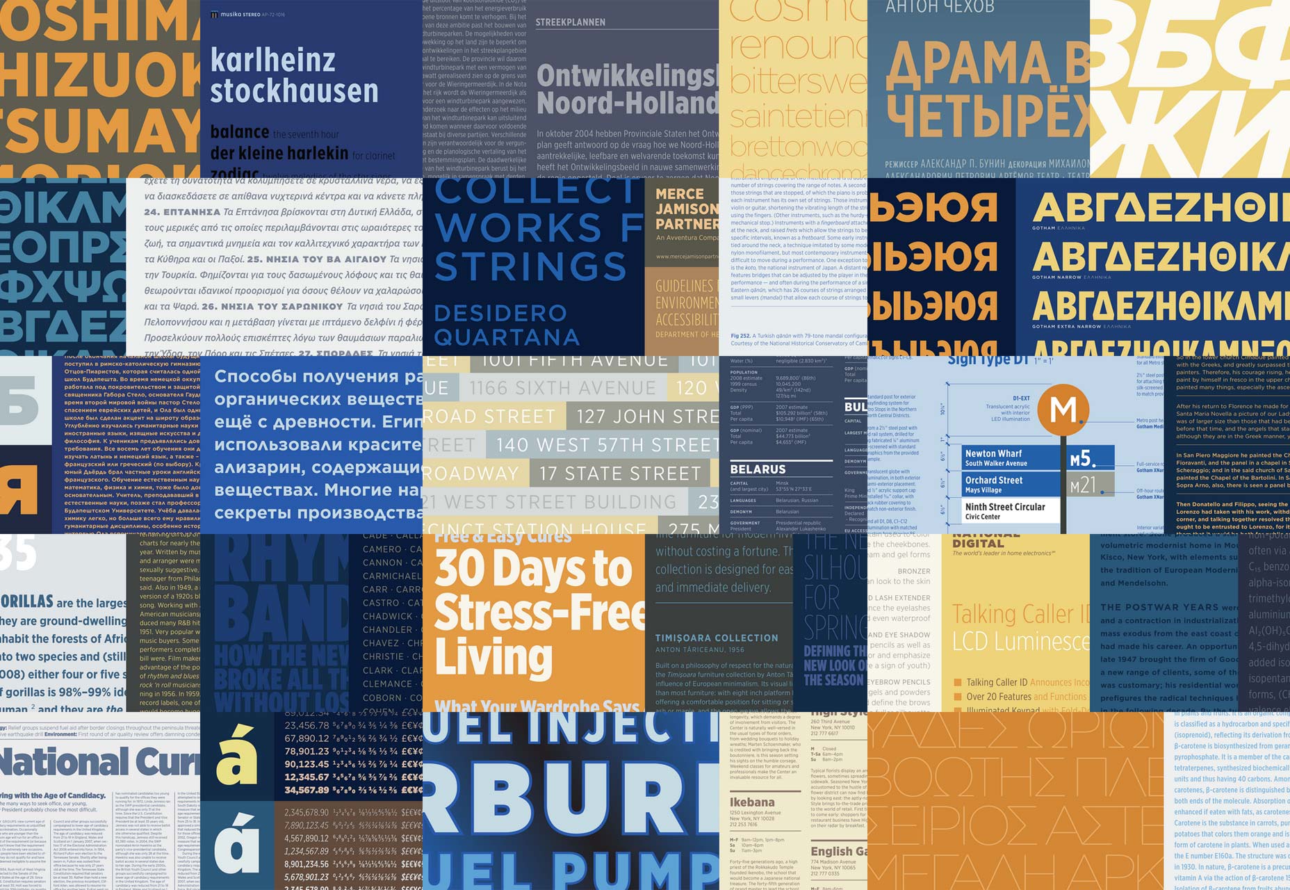
The typeface Gotham is one of the most popular sans-serifs in circulation. Designed at the turn of the millennium by Tobias Frere-Jones for the Hoefler & Co. type foundry, it is based on the basic letterforms that Frere-Jones saw in use on buildings around Manhattan, in signage and architectural lettering.
The quintessentially American feeling in the design has resulted in the typeface’s use in countless branding projects—Barack Obama’s presidential campaign, the National September 11 Memorial & Museum, and Saturday Night Live, as well as many other household names have adopted Gotham.
Described by Hoefler & Co. simply as, “What letters look like” it’s the typeface’s modernity, honesty, and assuredness that make it so popular.
As with many typefaces, with great popularity comes great overuse. Designer’s immediately took to Gotham, and it started to become a highly predictable choice. If you want to capture the spirit of Gotham, but would like a little more exclusivity, there are some excellent free alternatives, we’ve collected some of them here. Enjoy!
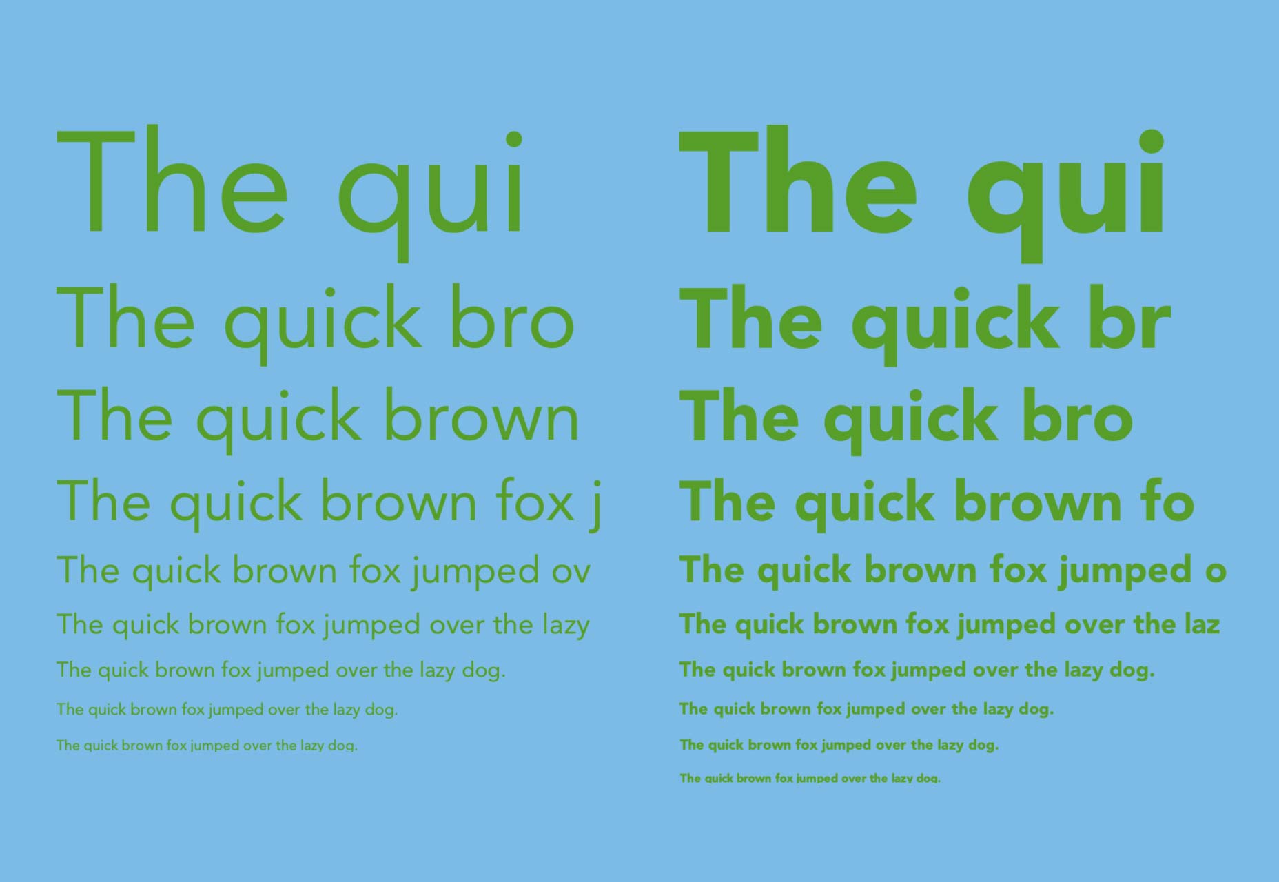
1. Montserrat
Designer Julieta Ulanovsky named Monserrat after the neighbourhood in Buenos Aires in which she works. It was inspired by local architectural signage just as Gotham was. The marginally wider letterforms of Montserrat give it a relaxed feel that Gotham can’t muster.
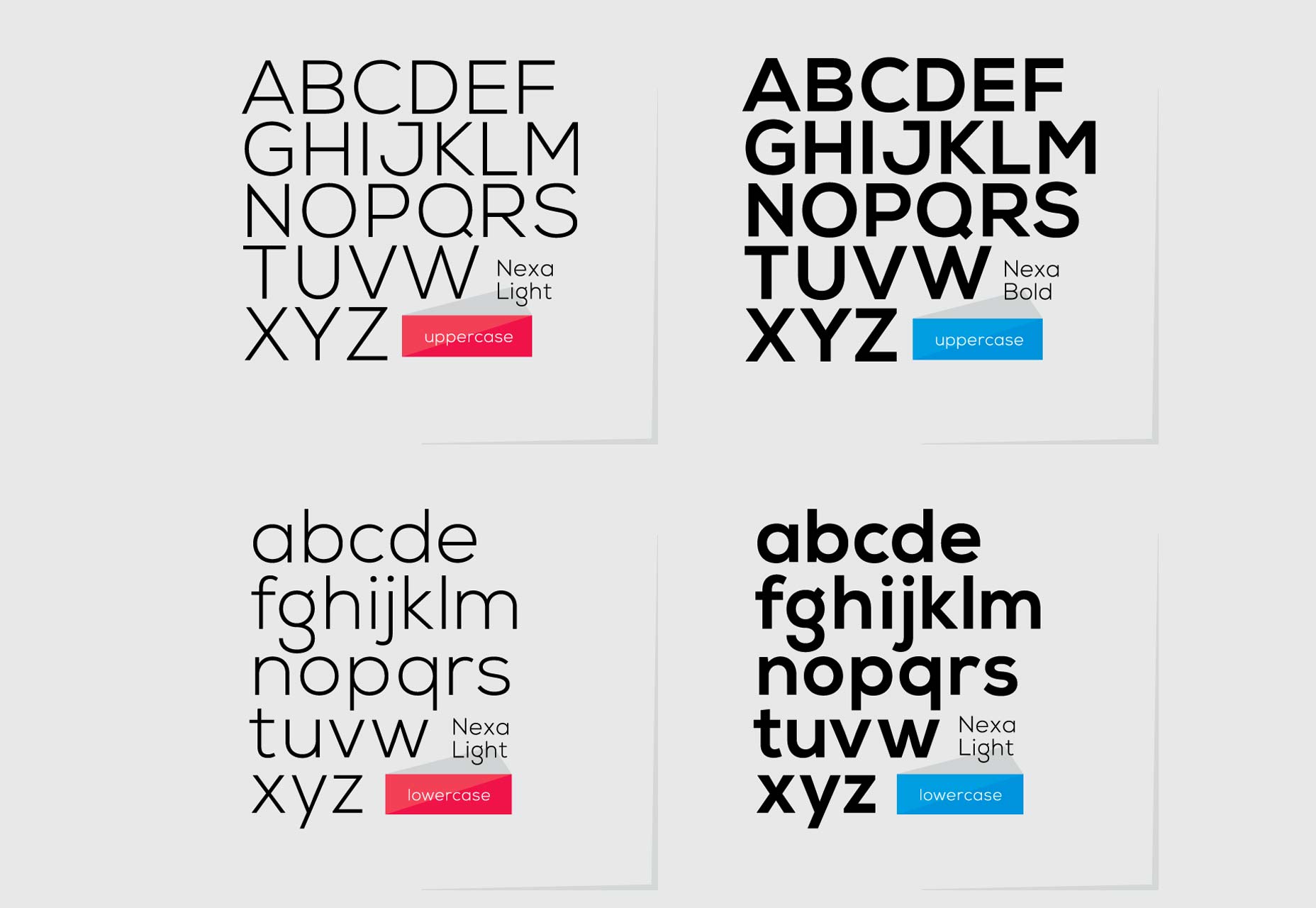
2. Nexa
Nexa Light, and Nexa Bold, are both available to download for free. They are a little more expressive than some of the typefaces in this list, notably the lowercase g and the uppercase J and Q. Much of the basic form is inspired by Gotham, and Nexa is great for branding projects.
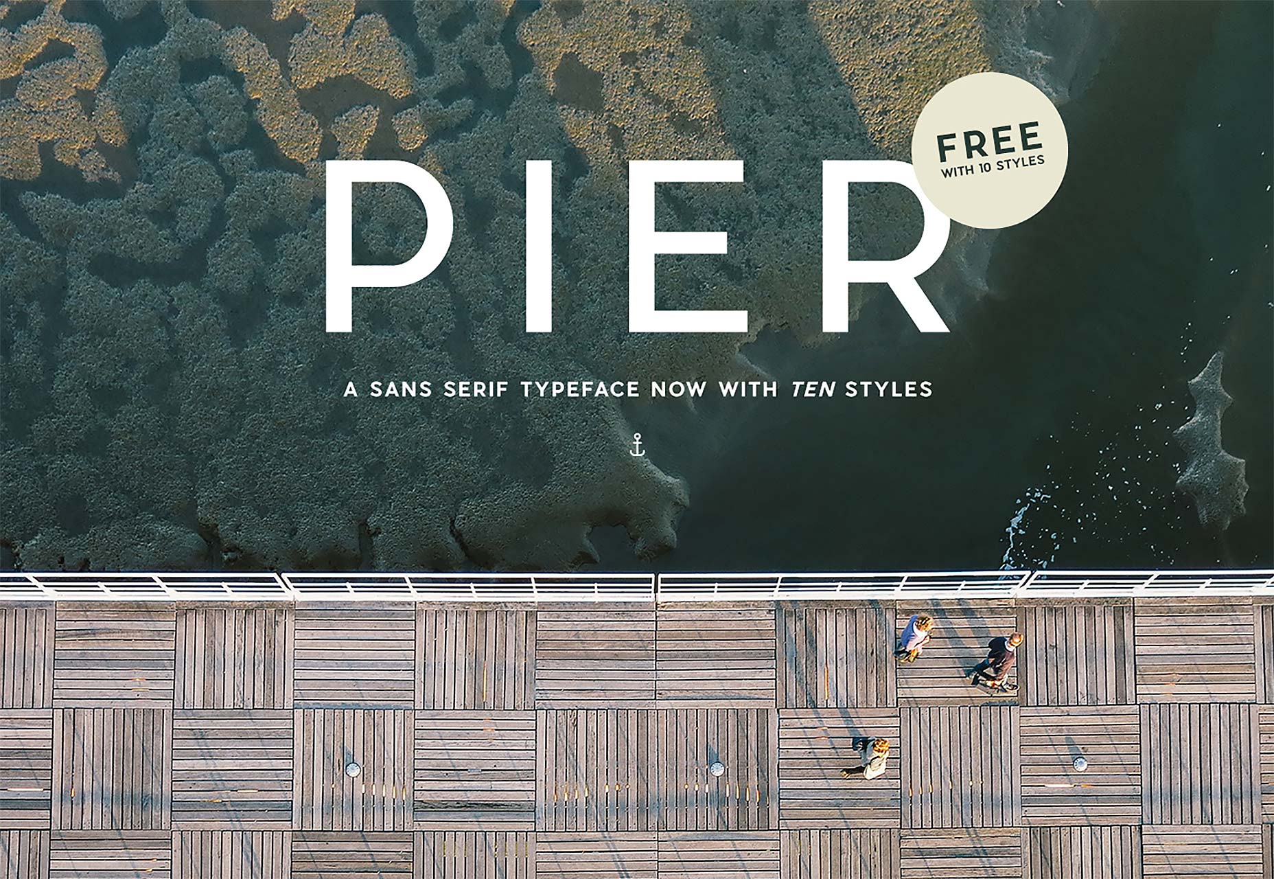
3. Pier Sans
Mathieu Desjardins’ Pier Sans is a free font with 10 styles. Similarly geometric to Gotham, Pier Sans pushes the 1930s feel a little further. Perhaps a touch more Miami than Manhattan.
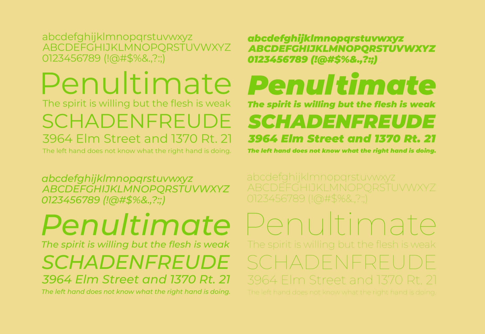
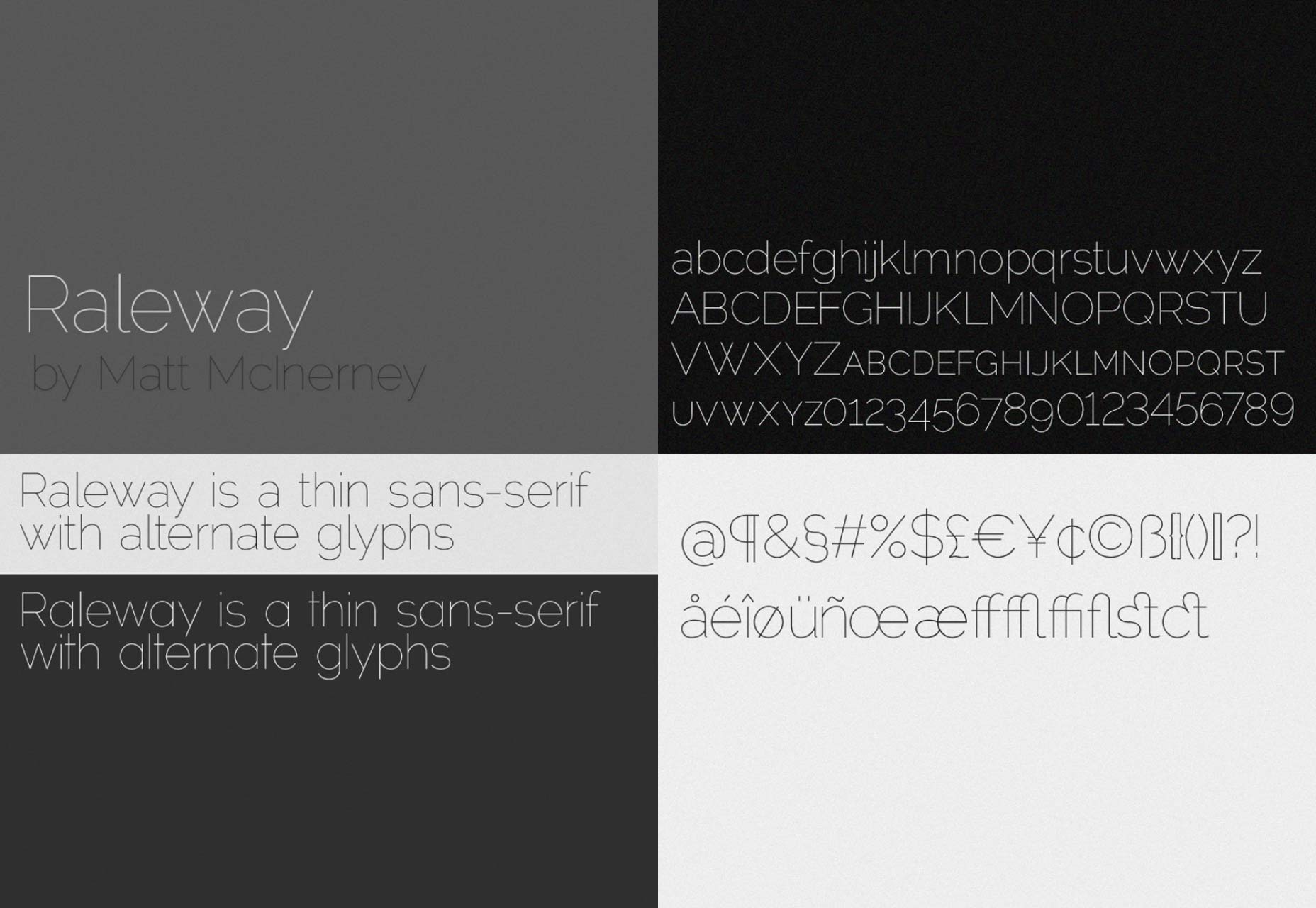
4. Raleway
Raleway is a comprehensive geometric sans-serif in 18 fonts. Weights range from thin to black, and each weight has an accompanying italic. Intended for use at display sizes, it is close to Gotham in numerous ways, with the obvious exception of the spine on the S.
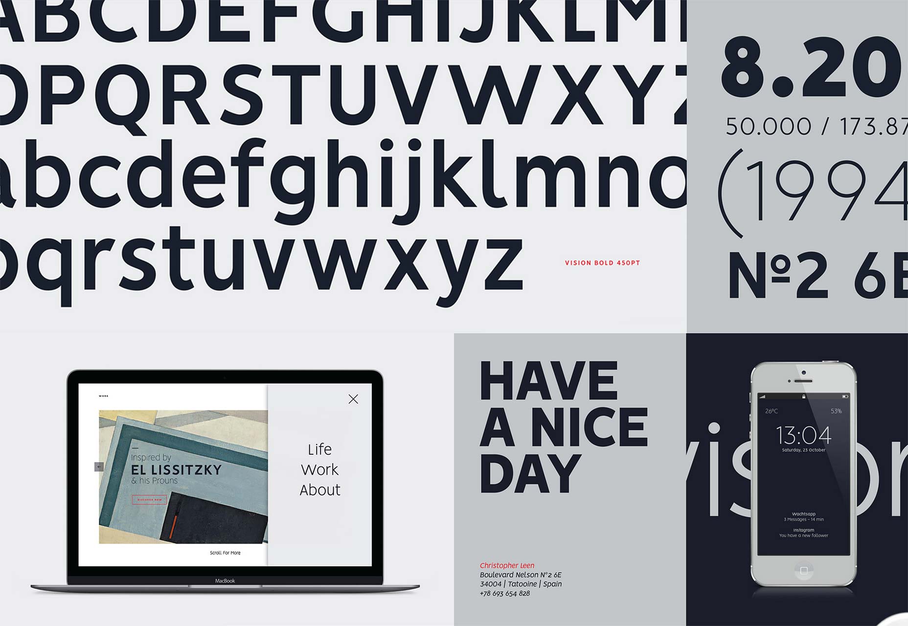
5. Vision
Vision is an entire family of 12 fonts free for both commercial, and non-commercial work. A fraction more humanist that Gotham, especially in the lowercase, Vision uses the same basic letterforms with a slightly narrower, less rounded skeleton.
6. Museo Sans
If Gotham is overused, it is only marginally more overused than the next typeface in our list. Museo Sans is wildly popular with web designers because it offers the same aesthetic, for nothing. Museo Sans 500 can be downloaded for free for commercial and non-commercial work.
7. Gothvetica
Gothvetica: Gotham, mixed with Helvetica. The sort of mashup that only seems like a worthwhile endeavour when type designers get together for one too many drinks. But somehow it works. It’s a fun project that’s free for non-commercial work.
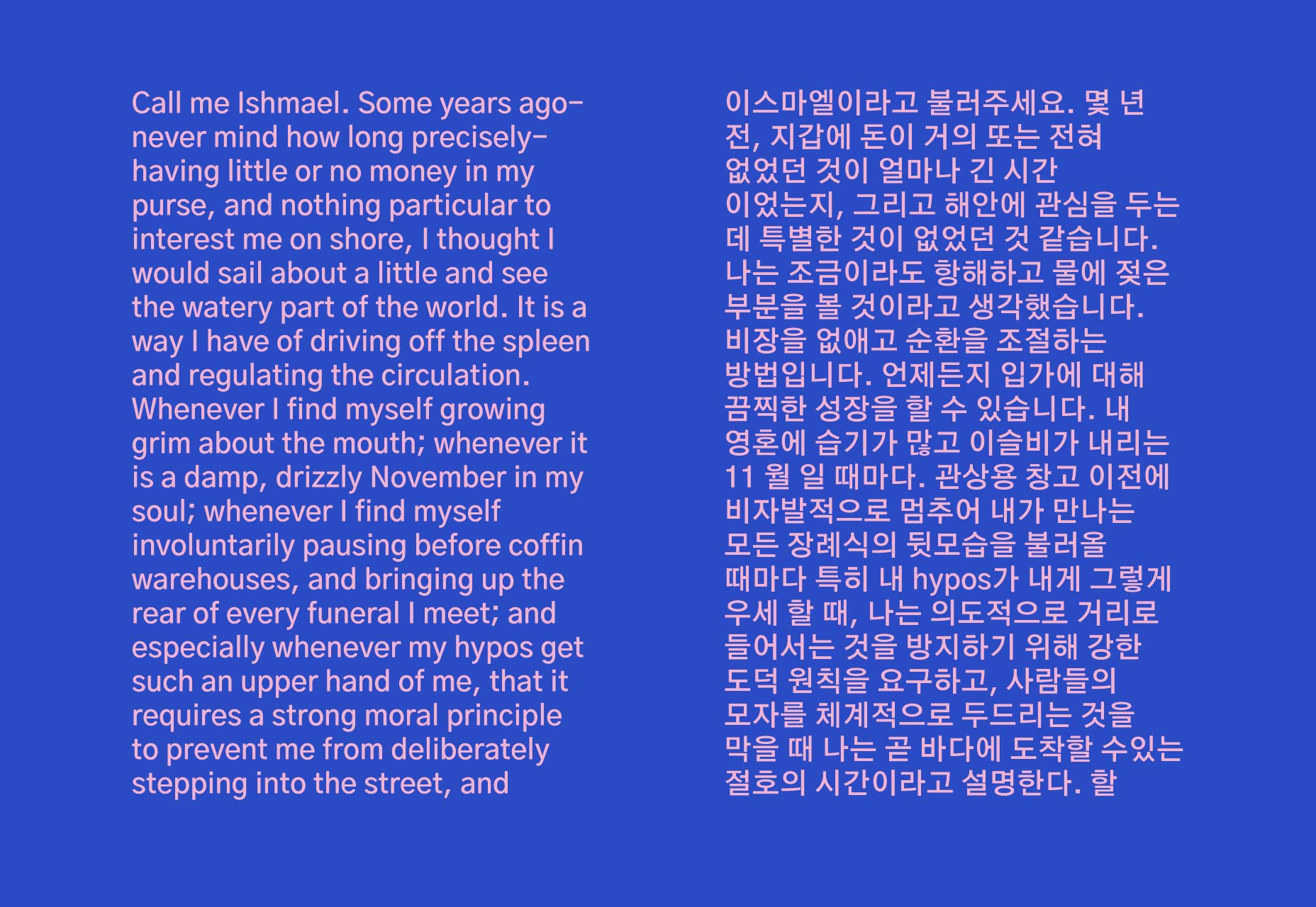
8. Gothic A1
Gotham is understandably American, considering its roots in the architectural identity of New York, but the popularity of its simple modernism extends far beyond America shores. Gothic A1 is a free sans-serif with similar a similar feel, but with extensive support for Korean as well as Latin characters.
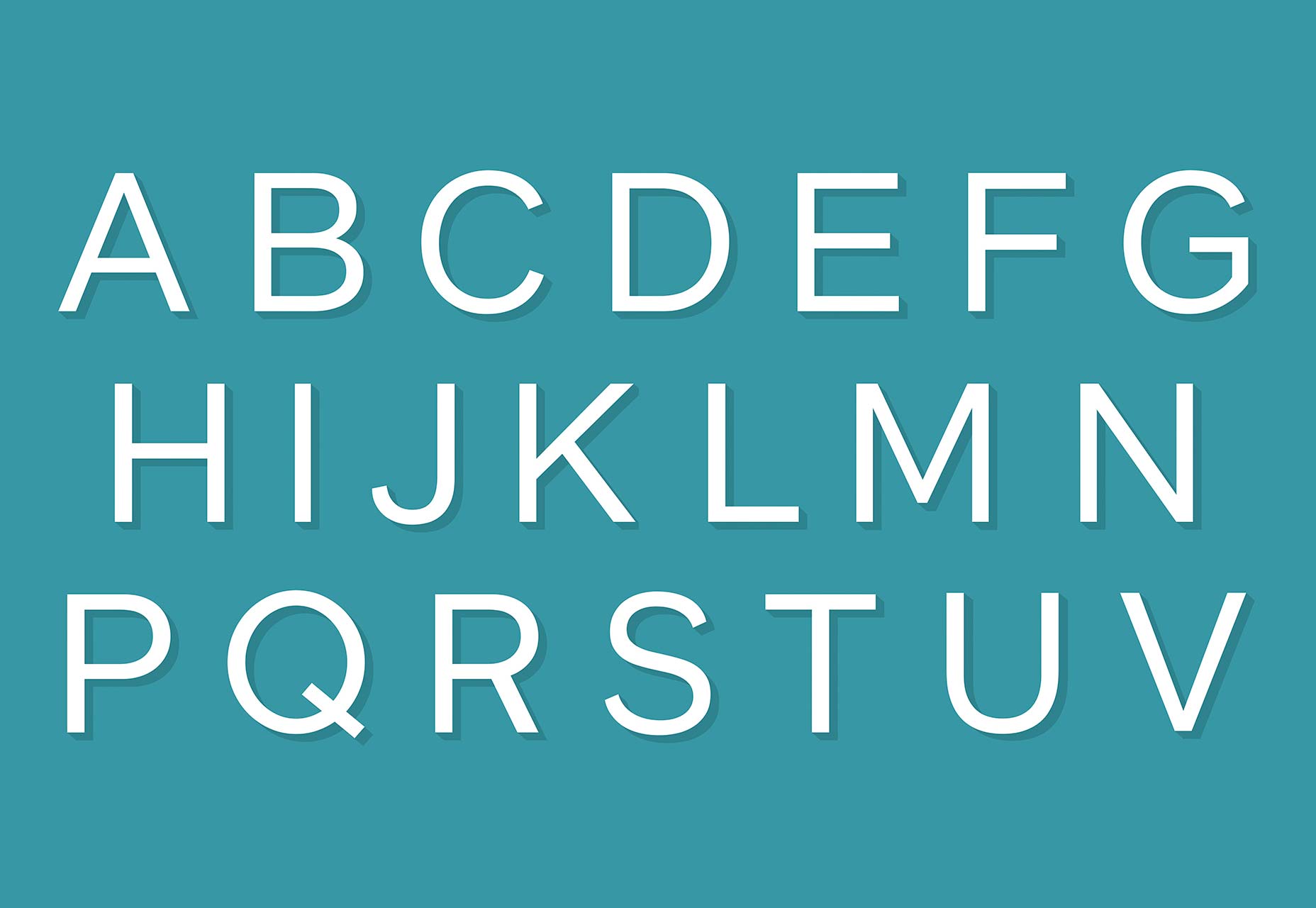
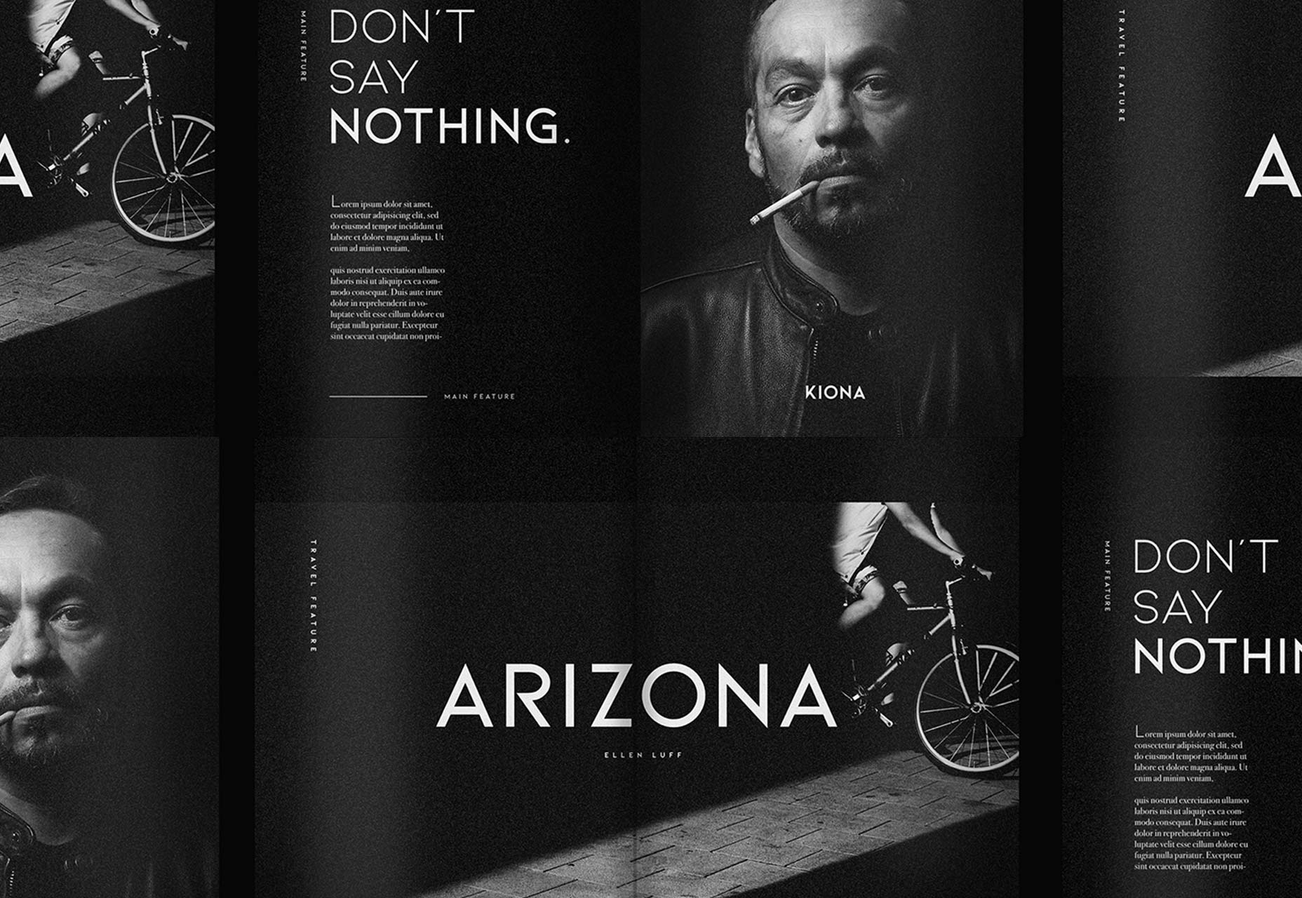
9. Kiona
Kiona is a minimal geometric uppercase typeface that feels similar to Gotham in many of its characters. But Kiona emphasises the diagonal in its distinct K, and R. Kiona light, bold, and semibold are all premium fonts. Kiona regular is free to download.
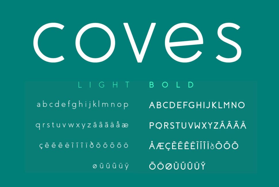
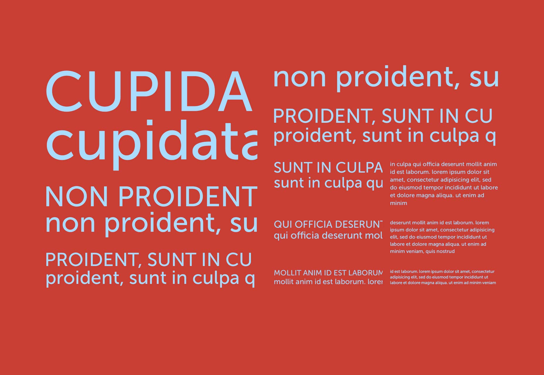
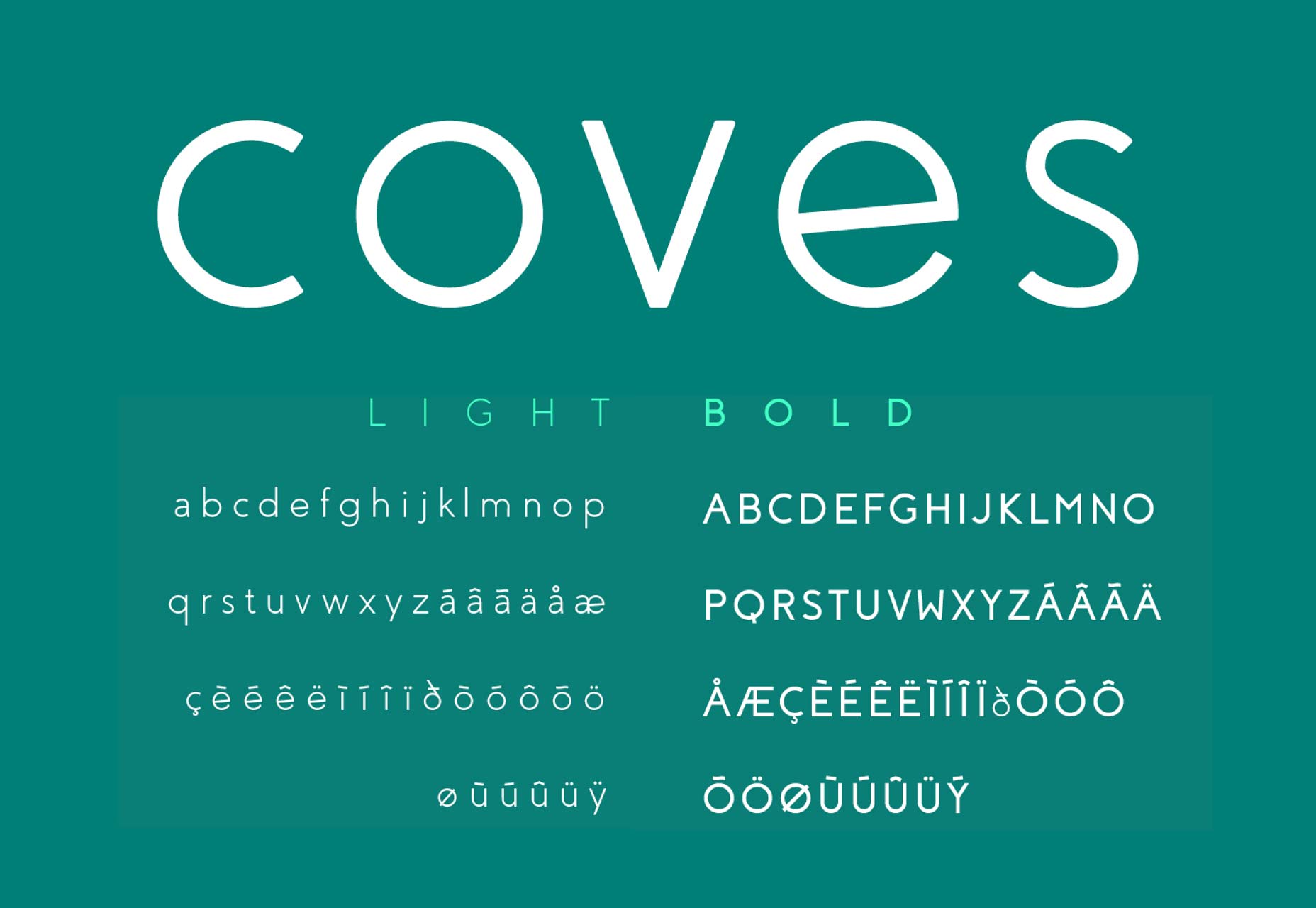
10. Coves
Coves is a simple geometric sans-serif that shares much of its DNA with Gotham, the apex on the M, the lack of cross-bar on the J, the shape of the double-height a, all follow the same pattern. It’s free for personal use, but for commercial use you’ll need a license.
Bonus: 5 Premium Font Alternatives to Gotham
The sheer volume of work involved in designing a complete typeface family means that when typefaces are a labor of love, they normally focus on a few key weights or styles. Commonly you’ll get a regular and a bold, but no italic. The exception is when a project is taken on by a community of volunteers, such as the team behind Montserrat, when it is able to grow into a wider set of fonts.
If you need a comprehensive set of characters, or a variety of weights, then a premium font family could be the answer.
Premium fonts aren’t necessarily better than their free alternatives, but the designers have been able to invest the time necessary to draw more glyphs.
Here are five premium alternatives to Gotham, for those that need a little more flexibility.
11. MALLORY
If you love Gotham but want to opt for something different, why not pick a typeface by the same designer. Mallory is a little more expressive in heavy weights, but is similarly proportioned.
12. EFFRA
From $21 per font / Also available on Typekit
Effra is a highly flexible family of fonts that unusually includes support for Arabic script, if you’re designing for an international client Effra is a prudent choice.
13. FF MARK
If you’re a fan of Gotham, but wish it were a little more geometric, then FF Mark is the typeface for you.
14. LOEW NEXT
Loew Next is a redrawing of an earlier attempt at a simple, modern sans-serif by the same designer. It features an extremely diverse character set.
15. AVENIR
Pre-dating it by over a decade, Avenir’s roots are the same type of typographic exploration—this time by Adrian Frutiger—that led to Gotham.